Friday, 31 March 2017
Weekly Update
So now i'm back working on my contents page and i'm just editing the image that i have chosen for example ensuring that i have erased the background and left the image to look smooth rather than it being messy. Im also looking at other magazines contents pages from the pinterest boards i created to see whether i can use some ideas. We break up for the holidays today so i'm going to be working on my double page spread next week. Sketching a flat plan and even looking at double page spreads in shops to see what aspects of a contents page are important to attract consumers. Writing my article and interview will also be important for me to do, aswell as a pull quote to entice my target market. All of that i need to think about because we only have a month left to finish this so i've got to finish my contents page quickly but at this point ive simply just done the background . Thats all for now, check next week for more updates. byeee!
Tuesday, 14 March 2017
Sunday, 12 March 2017
Flat Plans - Contents Page
Using Powerpoint to create the contents page flat plans i wanted to ensure that they were simple but effective and did not look too unorganised. Which is why i tried to keep the layout to look quite organised but still lots of aspects to the page so it does not look somewhat boring. When actually creating my magazine i may add or not include areas but now i have a rough idea of how i would like to do it. The first and second flat plans is quite simple and allows the magazine to be informative but not too chaotic because the front cover is quite busy and follows some conventions of a pop magazine. The 3rd flatplan is quite different and rather than doing a photoshoot with a different model i would place the front cover to show what would be inside.
Flat plans from Manisha_P
Contents Page Frankenstein Flat Plans
Front Cover - Step by step
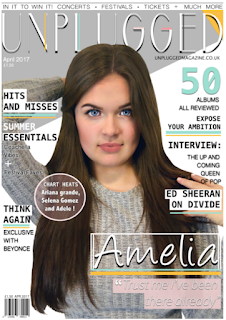
When looking at this again i decided to use my colour scheme more prodominantly as it appeared to dull to be a pop magazine therefore i added pops of colour on for example the subtle wash over the flash.
Since last time, i changed some significant aspects in order for it represent the pop genre more evidently through the use of more colour. This seems to promote happiness and joy which is what the magazine is selliing through the shared interest of music.I specifically added slightly more pink for example where the + is in order for it to bring attention to that area. I then noticed after comparing to other magazine that i needed to enlarge the font, i made all of the fonts big and intensified the drop shadow in order for it to stand out more when printed and appear more professional and sophisticaticated.Additionally i noticed small elements such as the the "festival" to not be easily readable, therefore i enhanced the size of the glow and added it to the "coachella vibes" aswell in order for the front cover to have a sense of continuity. After switching colours around and adding and enlarging the font the magazine seemed to follow the conventions yet stand out and appeal to consumers through the simple layout and bright colours.
Sunday, 5 March 2017
Weekly Update - 07.03.17
Nearly finished! Still adding some sell lines onto my magazine and changing things around but the majority of the aspects are gradually being completed. Ive been adjusting the background colours to ensure that all features come together. and simply added little blocks of colour to ensure text stands out. Check for more updates for a production diary for my front cover coming up. Byeee!
Subscribe to:
Comments (Atom)


