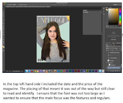
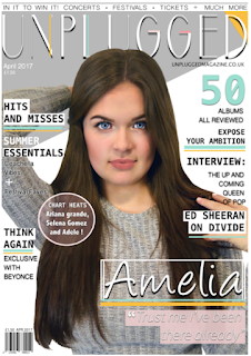
When looking at this again i decided to use my colour scheme more prodominantly as it appeared to dull to be a pop magazine therefore i added pops of colour on for example the subtle wash over the flash.
Since last time, i changed some significant aspects in order for it represent the pop genre more evidently through the use of more colour. This seems to promote happiness and joy which is what the magazine is selliing through the shared interest of music.I specifically added slightly more pink for example where the + is in order for it to bring attention to that area. I then noticed after comparing to other magazine that i needed to enlarge the font, i made all of the fonts big and intensified the drop shadow in order for it to stand out more when printed and appear more professional and sophisticaticated.Additionally i noticed small elements such as the the "festival" to not be easily readable, therefore i enhanced the size of the glow and added it to the "coachella vibes" aswell in order for the front cover to have a sense of continuity. After switching colours around and adding and enlarging the font the magazine seemed to follow the conventions yet stand out and appeal to consumers through the simple layout and bright colours.


No comments:
Post a Comment