Sunday, 30 April 2017
THANK YOU!
This is my last update and I've finally finished my magazine. From the start of this course to the end i have progressed and gained a lot of knowledge on a variety of different software. Thanks to my teacher and my peers i have thoroughly enjoyed AS media studies and cannot wait for A2. I hope you have enjoyed going through my blog and i hope you are pleased with my magazine overall!
Improvements
I printed my magazine out to see how it looks and to determine any errors that still need improving. Before moderation me and my peers made improvements on post it notes to find ways of developing the magazine further and find out others opinions on my magazine that is targeted to their age group.
They said i need to take time to line up all of the columns and text to ensure there was a clean finish, and ensure all of the writing is clear to make my magazine looks organised. They further commented on the magazine needing to not be so close to the page edge. This is because when i first printed it out a whole side of both my double page spread and my contents page were cut off therefore the page numbers were not visible. I made all of the above improvements to my magazine, in particular on in design by adding the grids to ensure it was all accurately placed.
They said i need to take time to line up all of the columns and text to ensure there was a clean finish, and ensure all of the writing is clear to make my magazine looks organised. They further commented on the magazine needing to not be so close to the page edge. This is because when i first printed it out a whole side of both my double page spread and my contents page were cut off therefore the page numbers were not visible. I made all of the above improvements to my magazine, in particular on in design by adding the grids to ensure it was all accurately placed.
Saturday, 29 April 2017
Double Page Spread - Step by Step
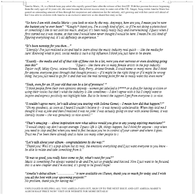
Since last time I have slightly changed my double page spread through little details that I noticed and realised. Specifically i noticed that in the article i missed the speech marks on some areas. This is vital for an article and placed no hesitation on correcting it. I then looked at the top strip and realised that it needed to go all the way accross in order to look more appealing rather than half finished. However i again looked back and realised that the plain black strip looked plain, therefore i added some branding of the magazine website which additonally broke up the intese large article aswell as matching the bottom strip well and therefore appearing to be professional.
Below is my newer version of my double page spread.
Double Page Spread examples
The following are examples of double page spreads that I found in magazines that I will be taking inspiration from:Contents Page - Step by step
I decided to change the layout out slightly to ensure it appeared more organised and therefore easier for the consumer to read and find page numbers easier. This also ensured it did not seem chaotic and too packed full of writing.
Since last time, I realised that the amount of colour, and initial reaction to the magazine is somewhat dull due to the blue not being as bright and fun, therefore i have changed the colour to the bright yellow due to it connoting happiness, and brightened the blue colour in order for it to stand out and both illustrate and follow the pop conventions. Additionally the faded "unplugged" triangle behind Dan seemed to not look as a triangle, therefore i moved it to end between the yellow and pink shapes which looks neater and more sophisticated rather than messy, therefore continueing the triangle shape from the front cover. After doing this i looked at the pink part and saw that it was slightly difficult to read, therefore i increased the opacity back to 100% which i realised made it look a lot more professinional and added more colour. Aswell as this i added two blue strips similar to the front cover in order to brighten and draw the readers attention to page 12 aswell, due to it before seeming somewhat dull. Last subtle aspects adjusted in order to both subvert and follow the pop genres and appeal to my target audience. I simply swapped some colours and brightened the tone in order to stand out and grab an individuals attention more, but i have ultimatley realised these small changes have amounted to my magazine significantly changing and in my opinion appearing more conventional and professional due to there no longer being any evident mistakes.
Weekly Update
So I was half way through my contents page when I realised I did not like the layout and the direction it was going in, below is what my contents page looks like so far however I am most likely going to change it in order for it look appear more interesting in relation to the pop genre. Aswell as this I am considering changing the main image to a male model instead due to pop magazines mainly being read by females and therefore by doing this I will be following the conventions of a pop magazine, however if I continue using Nathalia I will be subverting the stereotype.
Subscribe to:
Comments (Atom)


