Friday, 5 May 2017
Wednesday, 3 May 2017
Evaluation Updates
So after having to rush my evaluation last time, I decided to present and format each evaluation question using a different blog tool, in order to illustrate variety and use a tool that would better assert what my points were and the question posed. Additionally through expanding on my points for the evaluation and even considering what theorists i could integrate, i was able to access a more in depth evaluation on my final product. I found that through this i was able to explain my answers in more detail due to the thought and ideas being explained further. The dates of my posts however have remained the same in order for it to be in an organised way that will be understood easier, therefore i have explained the changes further made on the "step by step" posts whereby i detailed all of the aspects i altered, changed and developed.
Tuesday, 2 May 2017
Sunday, 30 April 2017
THANK YOU!
This is my last update and I've finally finished my magazine. From the start of this course to the end i have progressed and gained a lot of knowledge on a variety of different software. Thanks to my teacher and my peers i have thoroughly enjoyed AS media studies and cannot wait for A2. I hope you have enjoyed going through my blog and i hope you are pleased with my magazine overall!
Improvements
I printed my magazine out to see how it looks and to determine any errors that still need improving. Before moderation me and my peers made improvements on post it notes to find ways of developing the magazine further and find out others opinions on my magazine that is targeted to their age group.
They said i need to take time to line up all of the columns and text to ensure there was a clean finish, and ensure all of the writing is clear to make my magazine looks organised. They further commented on the magazine needing to not be so close to the page edge. This is because when i first printed it out a whole side of both my double page spread and my contents page were cut off therefore the page numbers were not visible. I made all of the above improvements to my magazine, in particular on in design by adding the grids to ensure it was all accurately placed.
They said i need to take time to line up all of the columns and text to ensure there was a clean finish, and ensure all of the writing is clear to make my magazine looks organised. They further commented on the magazine needing to not be so close to the page edge. This is because when i first printed it out a whole side of both my double page spread and my contents page were cut off therefore the page numbers were not visible. I made all of the above improvements to my magazine, in particular on in design by adding the grids to ensure it was all accurately placed.
Saturday, 29 April 2017
Double Page Spread - Step by Step
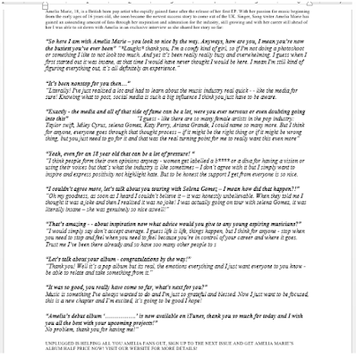
Since last time I have slightly changed my double page spread through little details that I noticed and realised. Specifically i noticed that in the article i missed the speech marks on some areas. This is vital for an article and placed no hesitation on correcting it. I then looked at the top strip and realised that it needed to go all the way accross in order to look more appealing rather than half finished. However i again looked back and realised that the plain black strip looked plain, therefore i added some branding of the magazine website which additonally broke up the intese large article aswell as matching the bottom strip well and therefore appearing to be professional.
Below is my newer version of my double page spread.
Double Page Spread examples
The following are examples of double page spreads that I found in magazines that I will be taking inspiration from:Contents Page - Step by step
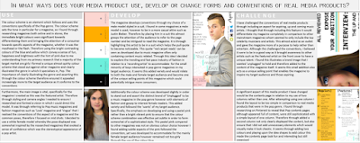
I decided to change the layout out slightly to ensure it appeared more organised and therefore easier for the consumer to read and find page numbers easier. This also ensured it did not seem chaotic and too packed full of writing.
Since last time, I realised that the amount of colour, and initial reaction to the magazine is somewhat dull due to the blue not being as bright and fun, therefore i have changed the colour to the bright yellow due to it connoting happiness, and brightened the blue colour in order for it to stand out and both illustrate and follow the pop conventions. Additionally the faded "unplugged" triangle behind Dan seemed to not look as a triangle, therefore i moved it to end between the yellow and pink shapes which looks neater and more sophisticated rather than messy, therefore continueing the triangle shape from the front cover. After doing this i looked at the pink part and saw that it was slightly difficult to read, therefore i increased the opacity back to 100% which i realised made it look a lot more professinional and added more colour. Aswell as this i added two blue strips similar to the front cover in order to brighten and draw the readers attention to page 12 aswell, due to it before seeming somewhat dull. Last subtle aspects adjusted in order to both subvert and follow the pop genres and appeal to my target audience. I simply swapped some colours and brightened the tone in order to stand out and grab an individuals attention more, but i have ultimatley realised these small changes have amounted to my magazine significantly changing and in my opinion appearing more conventional and professional due to there no longer being any evident mistakes.
Weekly Update
So I was half way through my contents page when I realised I did not like the layout and the direction it was going in, below is what my contents page looks like so far however I am most likely going to change it in order for it look appear more interesting in relation to the pop genre. Aswell as this I am considering changing the main image to a male model instead due to pop magazines mainly being read by females and therefore by doing this I will be following the conventions of a pop magazine, however if I continue using Nathalia I will be subverting the stereotype.
Friday, 31 March 2017
Weekly Update
So now i'm back working on my contents page and i'm just editing the image that i have chosen for example ensuring that i have erased the background and left the image to look smooth rather than it being messy. Im also looking at other magazines contents pages from the pinterest boards i created to see whether i can use some ideas. We break up for the holidays today so i'm going to be working on my double page spread next week. Sketching a flat plan and even looking at double page spreads in shops to see what aspects of a contents page are important to attract consumers. Writing my article and interview will also be important for me to do, aswell as a pull quote to entice my target market. All of that i need to think about because we only have a month left to finish this so i've got to finish my contents page quickly but at this point ive simply just done the background . Thats all for now, check next week for more updates. byeee!
Tuesday, 14 March 2017
Sunday, 12 March 2017
Flat Plans - Contents Page
Using Powerpoint to create the contents page flat plans i wanted to ensure that they were simple but effective and did not look too unorganised. Which is why i tried to keep the layout to look quite organised but still lots of aspects to the page so it does not look somewhat boring. When actually creating my magazine i may add or not include areas but now i have a rough idea of how i would like to do it. The first and second flat plans is quite simple and allows the magazine to be informative but not too chaotic because the front cover is quite busy and follows some conventions of a pop magazine. The 3rd flatplan is quite different and rather than doing a photoshoot with a different model i would place the front cover to show what would be inside.
Flat plans from Manisha_P
Contents Page Frankenstein Flat Plans
Front Cover - Step by step
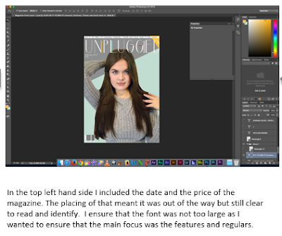
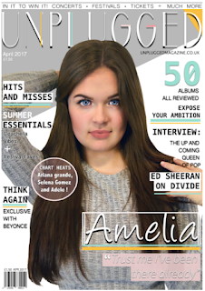
When looking at this again i decided to use my colour scheme more prodominantly as it appeared to dull to be a pop magazine therefore i added pops of colour on for example the subtle wash over the flash.
Since last time, i changed some significant aspects in order for it represent the pop genre more evidently through the use of more colour. This seems to promote happiness and joy which is what the magazine is selliing through the shared interest of music.I specifically added slightly more pink for example where the + is in order for it to bring attention to that area. I then noticed after comparing to other magazine that i needed to enlarge the font, i made all of the fonts big and intensified the drop shadow in order for it to stand out more when printed and appear more professional and sophisticaticated.Additionally i noticed small elements such as the the "festival" to not be easily readable, therefore i enhanced the size of the glow and added it to the "coachella vibes" aswell in order for the front cover to have a sense of continuity. After switching colours around and adding and enlarging the font the magazine seemed to follow the conventions yet stand out and appeal to consumers through the simple layout and bright colours.
Sunday, 5 March 2017
Weekly Update - 07.03.17
Nearly finished! Still adding some sell lines onto my magazine and changing things around but the majority of the aspects are gradually being completed. Ive been adjusting the background colours to ensure that all features come together. and simply added little blocks of colour to ensure text stands out. Check for more updates for a production diary for my front cover coming up. Byeee!
Friday, 24 February 2017
Weekly Update - 24.02.17
Friday, 10 February 2017
Weekly Update - 10.02.17
Last week I created 3 different flat plans to decide and help with how I should layout my front cover for my music magazine. Using slideshare for the first time I transferred my powerpoint onto the software and then embedded it onto my blog which was the quickest way to display my ideas. I also made a plan and researched ideas for my photoshoot to help my model with getting the best picture for the front cover. Finally we done the photoshoot with Danielle my model and I found out took 540 pictures! Going through all of them I finally found the one and began using photoshop to create the front cover. Byeee!
Photoshoot ideas
For the front cover I have researched some ideas for my model. I ensured they were looking at the camera for direct address aswell as them being mid shots as it is a front cover.
Photoshoot Plan
Model:
Danielle ('Amelia Marie')
Props:
I do not think I will use any props for the front cover although I will try and incorporate for example a microphone which relates to the music theme or some flowers.
Location:
For the location/background of my photoshoot I will most likely shoot in the studio with a plain white background with studio lights to ensure the lighting is good with the least amount of shadows, this also means that the focus will mainly be on the model (the music artist) for the front cover.
Outfit/Clothing:
Due to my magazine genre being a pop magazine the colour scheme is quite bright and fun already so there will be two outfits. One will consist of a white skirt with a grey off the shoulder top and another will be a yellow with blue trousers. Mixing these outfits will also compliment the magazines colour schemes however it depends which captures the photo best which will help decide which image to use as the lighting may adjust the shades of her clothing.
Flat Plans - Front Cover
Below is a slideshare presenting the flat plans I have created and am considering for my front cover
Friday, 3 February 2017
30.01.17 - Weekly Update
Last week i pitched my magazine and finalised all aspects for my magazine to ensure it is succesful. This week i also revised over my media theory work to ensure i am still revising and practicing for my media as exam. I also planned a photoshoot for my cover star next week to make sure i was fully prepared to start creating the magazine. Check next week for more updates. Byeee!
Tuesday, 31 January 2017
23.01.17 - Weekly Update
The cover star reveal! I finally chose someone to portray an artist for my magazine, creating a backstory which lead to an entire Prezi pitch about her and my entire magazine. Working on this took a while because I needed to decide and finalise aspects for my magazine like the name, font and colour scheme. That was everything I done last week. Byeee!
Finalised Masthead
Below is my final masthead name for my magazine. Looking at all of my fonts i found that this was the font that appealed and portrayed a sophisticated yet fun style. Using the crown from a different font and the colourful lines from my colour scheme to create another aspect of my name to make it stand out.
Saturday, 21 January 2017
Magazine Pitch
As you can see below is a prezi presentation i have created, which I will be using for my pitch for my chosen music 'artist'.
Masthead Fonts
Below are 10 different fonts which i am considering for my pop music magazine masthead:
Idilica :
This is a sans serif font which is quite thin and enlarges some letters, I like the simplicity of this font however it is not very bold for a masthead and may look out of place if it were to be on a front cover.
Park Lane NF:
Slightly bolder, I like this fonts uniqueness/style however it does not look like it would be seen on a stereotypical pop magazine front cover.
Street Cred:
This font is quite dynamic and bold, aswell as it being easy to read overall seems like a well suited font for my magazine.
Tostada:
Looking at this font initially it is a simple style aswell as it also being bold therefore perfect for a pop magazine as you would want it to stand out instantly. The unique style of the 2 lines to make up the letters is a good aspect.
Budmo:
This is style is formed from looks like pop art with the circles filling up each letter which makes it perfect for a pop magazine as it looks like a fun font.
Basic Title font:
Simple but effective this font creates a sense of sophistication which is what my target audience said they would like to see through-out a magazine.
The Next font:
Quite bold and almost cartoon like this font would be good as a simple masthead on the front cover of a magazine as it is also easy to read and recognise from a distance.
Dolce vita, Marbre sans, Arual:
These fonts are all similar as they very simple but effective with aspects of geometric shapes making up the letters to keep it looking modern and sophisticated.
Wednesday, 18 January 2017
16.01.17 - Weekly Update
This week i finalised everything and decided on my colour scheme and then using a website called dafont i need to find 10 different fonts and decide on the one that best fits my magazine. I have also come up with 7 different masthead names which i have chosen my final one to be 'Unplugged'. Then thinking about my cover star for my magazine i have began to create a prezi which showcases the back story and somewhat of an introduction to the artist that will be the face of my magazine. Deciding things like the photoshoot and what i would want the individual to represent as a main image on my pop music magazine. That was mostly everything i put towards my front cover magazine. Check next week for more updates. Byeee!
Masthead Names
For my pop music magazine i needed to come up with at least 5 different names which would be unique to the magazine i'm designing.
Below are the following which i am considering:
-Pop Reign
-Liberate
-QP
-Unplugged
-Pop Style
-Queen Pop
-Royalty
Below are the following which i am considering:
-Pop Reign
-Liberate
-QP
-Unplugged
-Pop Style
-Queen Pop
-Royalty
Tuesday, 10 January 2017
Colour Scheme
Through
looking at all of my colour schemes I created, I finally chose this colour scheme.
Firstly I ensured the colour scheme included a black and a white as it is
important to ensure that a dark colour is present to then use as a font colour
which will allow people are able to clearly read for example regulars. The
white has the same reason as a lighter colour is needed for contrast as well as
ensuring it looks bright to relate to POP, which is my music genre. Looking at
my overall colour scheme it consists of quite bright fun colours. Although to then
relate to the minority of male audience I found a blue/green toned colour that
contrasted well with the pink. It is almost an aluminous colour but is still
slightly toned down. The baby pink is also quite pastel and subtle with somewhat feminine connotations, ensuring it is not a bright pink which related to ‘Barbie’.
Monday, 9 January 2017
09.01.17 - Weekly Update
Back at school this week and straight onto the actual pop music magazine. Starting with colour schemes i used a website called 'coolors' which allowed me to find lots of different colour combinations and determine which would best suit my pop magazine. After finally deciding i chose my colour scheme and began to consider masthead names for my magazine. See you next week. Byeee!
Friday, 6 January 2017
Subscribe to:
Comments (Atom)


