
Manisha Panesar - Candidate no. 7366
Monday, 26 December 2016
26.12.16 - Weekly Update
Mainly mood boards this week. Went really quick with xmas being soon aswell. Finished my contents and front cover mood boards using pinterest and put links on my posts so you could see the whole page. This was simple and allowed me to create an idea of how I would potentially layout my magazine pages. Finally finished my readership profile using my questionnaire data to be specific. This therefore will means I can adjust my magazine to best satisfy the target market for my music magazine, to assist me with this I finished a detailed analysis of 2 pop genre music magazines to inspire the magazine I will be creating. It allowed me to consider what my usp would be to differentiate my magazine from the rest aswell as identifying the common aspects most pop music magazines have in common (such as artists, bright colours). See you next year for more updates. Byeee!
Pop genre music magazine comparison
 We ❤ Pop:
The masthead is clear and easily recognisable for the consumer to notice as the black significantly stands out against the white speech bubble. The bold font and shortness of the name makes the magazine more memorable to grab the audiences attention. You can instantly identify the target audience as being mainly female teenagers due to the obsessive us of pink throughout the front cover. Pink connotes femininity which justifies this, despite the magazine being somewhat chaotic you are still able to see the colour scheme of mainly pink, purple, white and black. The main image is of a female pop star which is in the centre to attract fans to be interested in what the magazine is about, aswell as there being a lot of secondary images and cover lines to anticipate what is inside to grab the audiences attention. Cheryl could be on the front cover as a role model to be an inspiration for younger girls aswell as possibly one of their favourite music artists. Including the 10 posters that are inside each issue which is an incentive to purchase the magazine as they are most likely some of the customers favourite artists. Furthermore due to the target audience most likely being younger and living at home they may enjoy using the posters to decorate which allows it to relate more so to them. There is a lot on this front cover as this is a weekly magazine therefore they need to include as much as possible to inform the consumer. It is clear that they do not just restrict their magazine to music only as they have a cover line for 'summer shopping guide' which would clearly attract female audiences. The flash is bright yellow and ultimately stands out against all of the other aspects on the front cover although it is still reasonably small. Referring back to the top strip it is about another popular well known music artist, Justin Bieber. The question is quite interesting and makes them want to read the magazine and find out what gossip there is.

The main image is of a big music artist 'Katy Perry' who is in the centre dominating the front cover as it is one of the main features of the magazine to attract the consumer. The flowers, hair, makeup and dress are all aspects that create a sense of femininity that immediately suggests it is targeted at mainly females. You can immediately see that the style is still pop with a fun edge but still sophisticated. There are aspects of it being a smart professional and high end as it is quite simple. It is a monthly magazine which justifies why the front page does not look chaotic and the layout is more simplistic, which contributes to the higher price. The masthead and the cover lines all use the same bold font which remains within the colour scheme being, although her name 'Katy Perry' is in a different font which allows it to stand out. Representing the significance and importance of her she is overlapping the masthead. The focus is also towards the flash which draws attention to the feature inside it, the bright outline causes it to stand out. The masthead is striking and bold with the contrast of the bright blue and yellow against the harsh black to ensure the magazine is recognisable. The cover lines emphasise what is inside the magazine with brief details, additionally the use of yellow contrasts and catches the audiences eye as it makes it clear that it is still important to read. I noticed on this particular music magazine front cover there is no bar code which either means it is a monthly subscription that is sent to customers and therefore cannot be sold in stores or the barcode is on the back. This is a good idea to make the consumer pick the magazine up and look at the back for the price which allows them to see what else the magazine includes. After researching I found that this was a July issue which justifies why the flowers were used to link with the summer theme aswell as adding to the feminine feel.
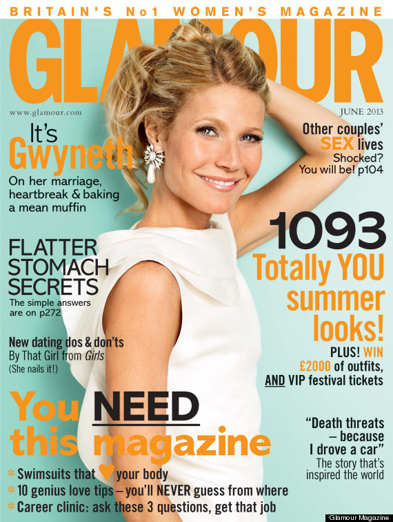
I also decided to look into Glamour magazine as I specifically found the sophistication and simplicity combined with the bright vibrant colors to specifically attract me and therefore attract the higher end of the target market that I am currently deciding on targeting, The ideas and simple font style holds a sense of professionalism which I found somewhat subverts the pop genre but in a good way as it appears less childish and more for older youth whom also enjoy pop music. You can immediately see the magazine holds a fun energetic nature which is similar of the Pop genre which would attract and appeal to a consumer wanting to purchase it. Additionally the cover lines being different sizes and some in different fonts seem to be a good detail that allows a reader to look at each bit of content and therefore could be an aspect I try and incorporate. This therefore all together seems to attract a more mature audience whom enjoy reading fashion and is therefore something I will use as inspiration for the final product as this specifically alongside the simple masthead is unique and is differentiated well from the other magazines which makes it more appealing. I will consider this to form a clear brand for my magazine as it is clear in all of the above including this that a strong brand attracts an audience and allows them to recognize it frequently on a shelf.
Wednesday, 21 December 2016


Tuesday, 20 December 2016

Readership profile
My readership profile consists of both boys and girls, majority being females and aged around 16-17 years of age. Using the data gathered from my questionnaire i can understand that my target market audience for my pop genre music magazine rarely go to concerts and on average preferred monthly magazines more than weekly magazines, but not by a lot. They mainly enjoy listening to music and meeting up with friends which is relevant as it allows me to specifically include content like new music or concerts/festivals to go to with your friends which will intrigue/attract them to the magazine more. Although i found that most people who took my questionnaire said they only go to concerts once a year or never which could be due to them not being aware of them so i could include some advertisements to make people aware of events where they can easily access tickets. After asking whether my target audience would mind having advertisements in the music magazine almost all of them said no which is good as i can then specify areas to relate more so to them. They have also listed their favourite songs and favourite artists, however almost all of them said they could not pick just one. This created overlaps which i could clearly see everyone had in common some favourite artists which ultimately suggests that i could include an aspect such as 'top 100 songs this month'. My audience is mainly younger teens who said they would prefer a magazine to be of a price between £1.50 - £2.00 which means that the magazine can be of a higher quality of production the more they would be wiling to pay. Additionally as my target market is of a younger generation it justifies why half of them ticked the style of the music magazine to be bright and fun and then just over quarter saying simplistic and sophisticated. Therefore i need to ensure i combine both the styles to attract my target market well. Due to the the design layout being of such importance to a magazine, the content aswell needs to be presented well. They listed that they would like to see the following: promotions, articles, interviews, festivals and reviews. Therefore suggesting that this is what my target audience want to see so i need to include to make it successful. Lastly for my magazine the usp will be surrounding the idea of discovering new artists and bands that's new music will intrigue my target audience. The fact that their music style will still be related to their preferred music type means that the focus will be to support/expose them to get into the industry and getting them recognised.
19.12.16 - Weekly update
Just finished collecting and displaying all of the data using infogram and finally posted my vox plot. It was hard to understand how to edit and slow the video down so you were able to read the writing but i got there in the end. I then collected all of the data from my questionnaires and created lots of charts on infogram, which allowed me to assess the results and understand/ gather a brief idea of what my target audience prefer. The last thing this week was my mood board which i completed on pinterest. I found around 30 images which were somewhat related to the music genre pop. This was quite good as it ensured i could gather/recognise what is associated with the music genre and how i need to visually create my magazine aesthetic. Check for more updates net week. Byeee!
Subscribe to:
Posts (Atom)